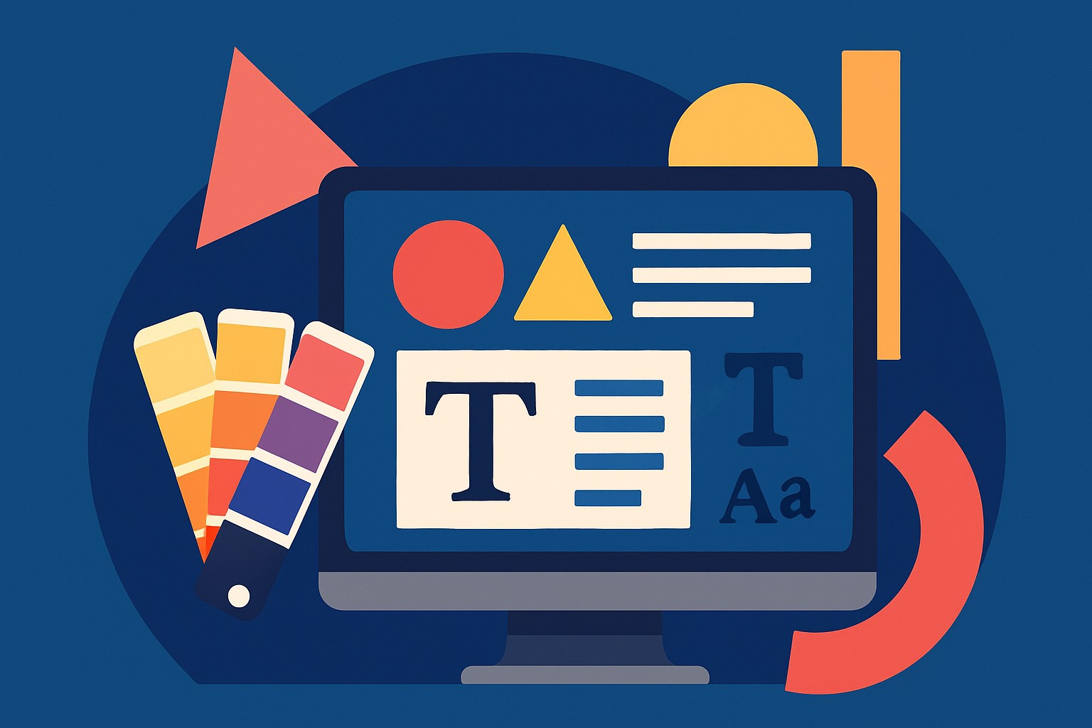
Graphic Design Principles
Essential rules of design to help you create balanced, engaging and memorable visuals.
Updated: 1 April 2026
Focus on Alignment
Alignment ensures your design has a sharp, ordered appearance. Align text and elements relative to each other—centre, right or left—to create a pleasing connection. If something feels off, check your alignment.
Use Hierarchy
When your design has multiple elements, give extra visual weight to the most important message. You can establish hierarchy by using larger or bolder fonts, placing critical information higher on the page or using shapes to frame the focal point.
Leverage Contrast
Contrast highlights important elements and adds emphasis. Combine opposing qualities—dark and light, thick and thin, bold and delicate—to draw the viewer’s eye to key parts of your design.
Repetition & Consistency
Repeating colors, fonts or shapes ties your design together and reinforces your brand’s look and feel. Consistent visual elements help people remember your message.
Proximity
Group related items together to create relationships and declutter your design. Clustering similar elements supports comprehension and improves organization—especially in lists or menus.
Balance
Balance gives a design stability. It doesn’t always mean symmetrical designs; you can also achieve balance by carefully placing contrasting elements (e.g., a dark shape on one side balanced by lighter elements on the other).
Colour Psychology
Colour communicates subconsciously. Understanding colour theory helps you set the mood: blue often conveys calm or trust, while red can energize viewers and prompt action.
Use Negative Space
The blank areas of your design, known as negative space, are as important as the filled areas. Leaving space around elements helps highlight what matters and keeps your design clean and easy to read.
By applying these fundamentals—alignment, hierarchy, contrast, repetition, proximity, balance, colour and negative space—you can craft professional‑looking graphics that communicate your message effectively and leave a lasting impression.
Applying the Principles
When applying these principles, start by defining the most important message and make it the focal point of your design. Use contrasting colors or pair bold typefaces with delicate fonts to emphasise key elements. Repeat colours, fonts or shapes consistently to reinforce your brand and tie your visuals together. Group related elements together and use proximity to declutter your layout. Balance your composition by arranging visual weight—symmetrical designs distribute elements evenly, while asymmetrical designs use contrast to achieve harmony. Choose colours purposefully: blue evokes calm or trust and red prompts action; sticking to a limited palette helps maintain consistency. Finally, leave negative space so your content can breathe and the important parts stand out.
Developing an eye for design takes practice: pay attention to what resonates with you and observe how others apply these principles.